
Portrait, landscape, letterboxed, squares.
Images are typically shot in one of two formats, landscape or portrait. But on the web, they’re re-used in a variety of different crops. For web-publishers, this has become a hellish nightmare of multiple uploads or painfully slow trial and error of previewing layouts.
It’s exaggerated if your image container size/shape adapts as the viewport changes. What was once a portrait image on a desktop has become a letterbox slice on your mobile and everyone’s heads have been chopped off!
It’s a problem that anyone that has a responsive website has encountered at some point.
Back in 2014, I was at the peak of my love affair with Instagram. I had often thought there was something perfect about the constraint of a square photo. I believed that it was the fairest way to look at a photo across devices where their screens came in different orientations. Then in late 2015, they opened the floodgates to any old ratio. I was out.
Fast forward a year and Snapchat Spectacles caught my eye. They were sunglasses with a camera built into them that shot videos in a circular format specifically designed for the Snapchat app.
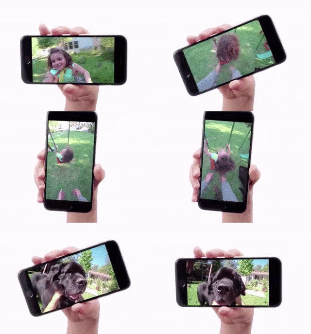
I imported a pair from the US and fell in love with them. The resulting footage was so authentic — it was like people could see my experiences, as me. But it was seeing the Snapchat Spectacles viewer when all the pieces fell into place.
Whilst the glasses recorded footage in a circular format, you never viewed it in a circle. It was sort of zoomed-in, which meant you could rotate the phone and change the crop that you watched the video in.
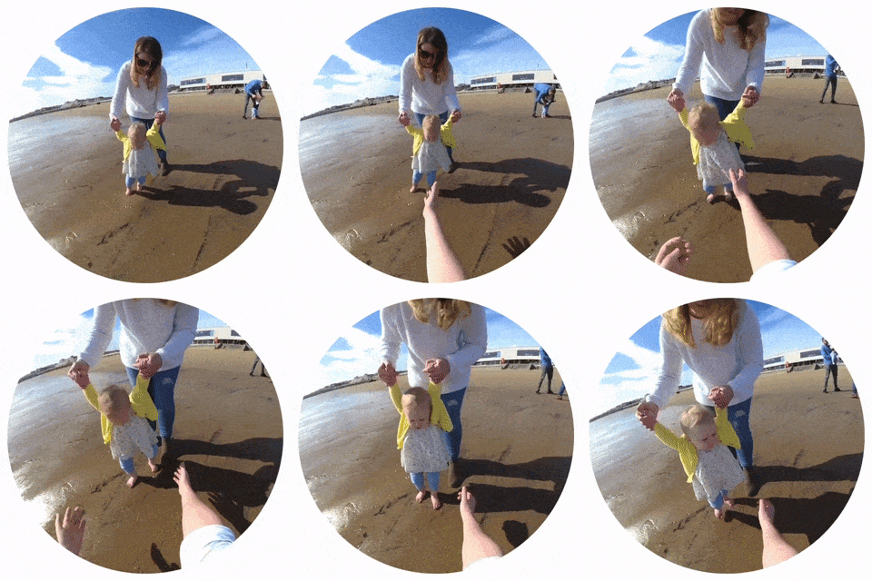
The constraints imposed by the hardware meant that you shot video so that it was always centrally focused. Which in turn, meant that you could crop the video into both portrait or landscape orientations without chopping peoples heads off. I started testing it out with my own footage, thinking that there might be something in it for responsive images. I was amazed at how well it worked.
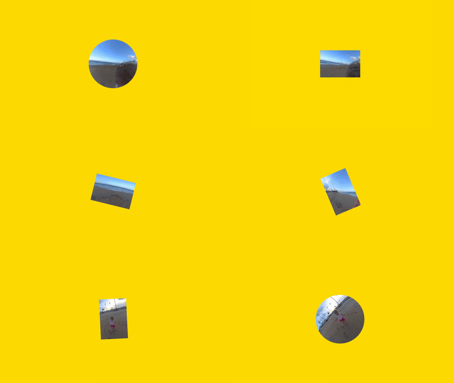
I believe that if your asset is shot with it being stored as a square in mind, you would be able to crop your image in landscape or portrait without any loss of focus.
Imagine having the confidence that those heads won’t get chopped off as you hit the publish button…
So, we’ve come full circle to my 2014 Instagram love affair with squares!
If you overlay a portrait outline and a landscape outline, like a Venn diagram, the common area, is a square. I’m using 16:9 ratios for my portrait and landscape rectangles, simply because its a widely-accepted screen size shared across laptops, desktops, televisions and a decent amount of mobile devices. Mobile devices can vary wildly (and seem to change with the wind), but the principle is the same and I’m going to build in safety zones that will accommodate for this variance.

The green square in the centre shows the safe zone. If it’s important, it should be in this area because there’s a very strong likelihood that it’ll be seen in any crop.
I then tried to recreate the Snapchat ‘any crop’ circle by aligning it to the outer edges of my landscape and portrait rectangles. I’ve coloured this bit orange: A circle of relative safety. I wouldn’t put anything of importance in here, but there’s a strong likelihood that it would be visible at some point in the assets lifecycle.
And because the outer circle extends past our rectangles, we can contain it all in a new square: the outer boundary of our asset. The corners that are red, are unsafe zones. Don’t put anything of value in there because it may never see the light of day.

Finally, we need to account for those nasty letterbox crops. There’s no ‘official’ convention for a letterbox ratio — at least not in the world of website design — so to do this I copied our original 16:9 rectangles and shrunk them inside the safe zone and extended them outwards. It creates a thinner set of rectangles inside the existing landscape and portrait crops, but importantly creates a new square at the heart of our asset. This is the super safe zone. Anything inside here will be visible on every permutation of the asset. And this is why centrally focused images are so important to responsive web design. I’ve detailed the super safe zone as a white square.

This means less than 50% of your image is safe and only 27% can be guaranteed visibility across the different croppings.
Better to know this though, than chance those heads getting chopped off? Or having to create different crops of your image and upload it multiple times?
Better still as I found out from personal experience; when you shoot with this format in mind, you naturally focus on the centre of the frame, which lends itself to better responsive assets by default.
It’s retrofittable too — simply crop your existing assets into squares with the safe and super safe zones in mind and you’ll instantly start benefitting from increased reusability of your assets. It works beautifully for images and background video and can help you build websites that only need one image upload to facilitate multiple uses.
The knock-on effect to design and development teams is impressive and something that I think you should consider for your next project.


